Every small business owner knows this exhausting routine.
You sit down to design an Instagram announcement, a WhatsApp flyer, or a product label. You spend fifteen minutes searching through desktop folders for your transparent PNG logo. You hunt through old invoices trying to remember the exact six-digit hex code for your brand blue. Then you realize you used three different fonts across your last four posts.
The result is visual inconsistency. One week your graphics look corporate and blue. The next week they look playful and yellow.
Customers notice this inconsistency. A disjointed visual presentation makes an emerging business look temporary, unorganized, and amateurish.
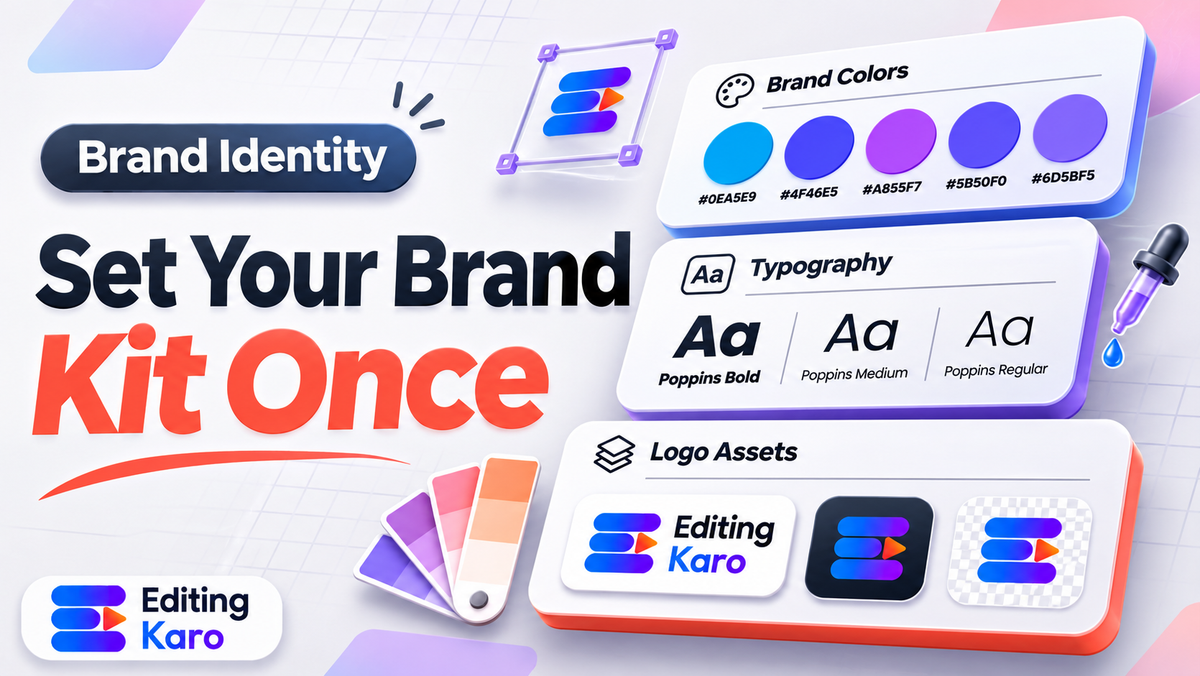
Setting up brand kit essentials for small business solves this friction permanently. A brand kit acts as the visual operating system of your business. It locks down your logo variations, color codes, and typography into a single digital library that you and your team can apply to any design in one click.
Here is how to build an efficient brand kit from scratch, even if you do not have a dedicated in-house graphic designer.
The 5 core elements of an essential brand kit
You do not need a fifty-page brand bible like Nike or Apple. For a small business or solo creator, a practical brand kit requires only five core pillars:
| Brand Element | What to include | Common amateur mistake |
|---|---|---|
| 1. Logo Suite | Primary logo, secondary stacked logo, and isolated icon/submark | Only saving one flat JPEG with an annoying white background box |
| 2. Color Palette | 5 specific hex codes (primary, secondary, accent, dark, light) | Guessing colors by eye every time, resulting in mismatched shades |
| 3. Typography Stack | 1 headline display font and 1 neutral body font | Using four different decorative cursive fonts across one flyer |
| 4. Imagery Guidelines | 3 defining rules for photography tone, lighting, and filters | Mixing dark moody photos with neon oversaturated stock pictures |
| 5. Graphic Accents | Consistent badge shapes, button styles, and border radiuses | Changing button roundness and drop shadow angles on every graphic |
Comprehensive design research published by the British Design Council reveals that businesses maintaining strict visual brand consistency across all customer touchpoints achieve significantly higher customer trust and premium brand equity.
Step 1: Build your five-color functional palette
Never pick colors at random. A professional color system follows the classic 60-30-10 interior design rule:
- 1The Primary Base (60%): Your dominant brand identity color. This appears on your primary website headers, main product packaging, and key banners.
- 2The Secondary Tone (30%): A harmonious supporting shade. This color provides depth on cards, alternate panels, and secondary backgrounds.
- 3The High-Contrast Accent (10%): A vibrant, attention-grabbing hue. Reserve this color strictly for call-to-action buttons, discount tags, and important alerts.
- 4The Dark Neutral: A rich charcoal (#1E293B) or deep espresso (#1C1917) for body text and headlines. Avoid harsh 100% pure black (#000000), which strains eyes on bright mobile displays.
- 5The Light Neutral: An off-white cream (#FAF9F6) or soft warm grey (#F8FAFC) for clean background canvas areas.
Take a practical example: imagine a sustainable handmade ceramics studio in Jaipur launching an e-commerce store and social content.
They establish a grounded earth palette:
- Primary: Terracotta clay (#C86D51)
- Secondary: Warm sage green (#8A9A86)
- Accent: Golden mustard (#E0A942)
- Dark Neutral: Charcoal slate (#2B2D2F)
- Light Neutral: Sand linen (#F5F2EB)
Whenever they create a graphic, they never guess colors. They open their palette and apply the exact hex values.
Review our dedicated brand colour palette guide and experiment with our free color palette generator to generate balanced hex swatches.
Furthermore, ensure that your text and background color pairings comply with accessibility contrast standards established by the World Wide Web Consortium (W3C), maintaining at least 4.5:1 contrast for legible reading.
Step 2: Establish your two-font typographic hierarchy
Typographic discipline separates amateur flyers from polished brand assets.
You only need two font families:
The Headline Typeface (Personality)
Your headline font conveys your brand's emotional voice. If your brand is modern and tech-forward, use a bold geometric sans-serif like Unbounded or Montserrat. If your brand is artisanal and elegant, select a refined serif like Cormorant or Playfair.
The Body Typeface (Utility)
Your body font exists purely for effortless reading. Never use decorative script or narrow novelty fonts for body copy. Stick to clean, neutral workhorse typefaces like Inter, Roboto, or Open Sans.
Explore our curated font pairing guide and test interactive font combinations using our free font pairings tool.
Step 3: Organize your logo asset variations
A single horizontal logo cannot fit every placement. If you try to force a wide horizontal logo into a circular Instagram profile picture, the icon shrinks into an unrecognizable line.
Prepare and save three distinct logo configurations:
- 1Horizontal Primary Logo: Used on website navigation headers, invoices, email signatures, and desktop banners.
- 2Stacked Secondary Logo: A centered version with the icon sitting above the company name, ideal for square social posts and product boxes.
- 3The Submark / Favicon: A circular or square emblem containing only your monogram or symbol, perfectly fitted for social avatars and mobile app icons. Review our rules for small business logo design.
Save every variation as a transparent 32-bit PNG file and an infinitely scalable vector SVG file.
Step 4: Create three master reusable social templates
The true power of a brand kit comes alive when you translate rules into ready-to-use design templates.
In your design canvas, build these three master templates:
- 1The Product Feature Template: A clean portrait layout (1080 × 1350 pixels) with your logo in the top corner, a cutout product photo in the center, and your primary brand color backdrop.
- 2The Quote / Insight Template: A bold typographic card featuring your secondary background color, quotation marks in your accent color, and your brand font for the text.
- 3The Promotional Announcement Template: A high-contrast graphic with a prominent discount badge, your accent button color, and your clear website URL at the base.
Whenever you need to publish content, simply duplicate the master template and swap the text and photo. Your feed instantly achieves a cohesive, magazine-quality aesthetic.
Defining photography art direction and lighting
Visual branding extends beyond flat vector shapes and typography. The style of photography you use communicates powerful subconscious signals about your product quality and pricing tier.
Include these three simple photographic rules in your brand documentation:
- 1Lighting temperature: Decide whether your brand lives in warm, golden sunlight or crisp, modern cool-white daylight. A luxury perfume or artisanal bakery looks best in soft, warm directional shadows. A financial app or medical clinic demands bright, shadowless high-key lighting.
- 2Composition and camera angles: Specify your default camera perspective. A food brand might mandate a 45-degree diner perspective, while a minimalist ceramics brand might prefer flat-lay overhead shots against textured linen backdrops.
- 3Prop styling and environment: List approved styling elements. For example, our Jaipur ceramics brand specifies that product photos should include raw clay textures, brass trimming tools, and dried botanical branches, while strictly banning plastic props or busy artificial surfaces.
Having clear photographic rules ensures that whether you shoot products on your own phone or hire an outside photographer, every image looks like it belongs to the same aesthetic world.
Doing it in Editing Karo
Editing Karo provides integrated Brand Kit management directly inside Pixel Studio, eliminating the need to copy-paste hex codes from separate text documents.
Here is how Pixel Studio streamlines brand management:
| Brand Kit Feature | Where to find it | How it accelerates your workflow |
|---|---|---|
| Centralized color swatches | Brand Kit Tab | Click to apply your saved primary, secondary, and accent colors instantly |
| Custom font integration | Font Library | Upload commercial brand fonts (OTF/TTF) and set default headline weights |
| One-click logo placement | Brand Asset Manager | Drop transparent logo marks onto any canvas with automatic corner alignment |
| Color palette testing | Color Palette Generator | Generate and test accessible brand color harmonies with hex code exports |
| Template library saves | Formats & Templates | Save custom brand templates for square feeds, 9:16 stories, and banners |
Every plan tier in Editing Karo gives you access to all four creative studios. Free users can customize designs and test layout tools. Subscribing to a Starter or Pro plan unlocks permanent Brand Kit persistence, custom font uploads, and watermark-free exports.
A five-point brand kit implementation checklist
Before finalizing your brand kit assets, verify these five essentials:
- [ ] Transparent logos: Are all logo variations saved with clean transparent backgrounds?
- [ ] Exact hex codes: Do you have your five exact color hex codes written down and saved in your editor?
- [ ] Accessible contrast: Does your body text color achieve at least 4.5:1 contrast against your background?
- [ ] Two fonts locked: Are your headline and body font families chosen and tested together?
- [ ] Profile avatar tested: Does your submark or icon look sharp when cropped into a circular phone avatar?
Stop wasting valuable hours reinventing your visual identity for every post. Open Pixel Studio, configure your Brand Kit, and give your small business the cohesive, professional presentation it deserves.
Frequently asked questions
What is a brand kit?
A brand kit is a centralized repository containing your company's core visual assets: logo variations, exact color hex codes, typographic font pairings, and graphic guidelines. It ensures that every marketing asset looks visually unified.
Why do small businesses need a brand kit?
Without a brand kit, team members guess color codes, use mismatched fonts, and stretch low-resolution logos. Having a single source of truth saves design time and builds professional credibility with customers.
What are the core elements of a brand kit?
The five essential elements are: primary and secondary logo variations, a five-color palette with hex codes, primary and secondary font choices, approved brand imagery styles, and basic spacing guidelines.
How many colours should be in a small business brand kit?
Stick to five colors: one dominant primary brand color (60% presence), one secondary supporting color (30%), one high-contrast accent color (10%), a dark neutral for text, and a light neutral for backdrops.
What logo file formats should a brand kit contain?
Always store transparent 32-bit PNGs for digital screens and scalable vector SVG or PDF files for commercial printing. Include full-color, all-black, and all-white reverse variations for diverse backgrounds.
How many fonts should I include in my brand kit?
Limit yourself to two font families: one expressive display font for headlines and titles, and one highly legible, neutral sans-serif font for body paragraphs, captions, and tables.
What is the difference between a brand kit and a brand style guide?
A brand kit is the functional digital collection of assets (color swatches, fonts, logo files) that designers drag and drop into templates. A brand style guide is the written documentation explaining the rules.
Where should small businesses store their brand kit?
Store assets inside your primary design platform (like Pixel Studio's Brand Kit tab) and maintain a shared cloud drive backup containing organized folders for logos, fonts, and vector illustrations.
How do I choose an accent color that stands out?
Choose a hue that sits opposite or nearly opposite your primary color on the color wheel. For example, pair a deep navy primary with a vibrant golden amber or warm coral accent.
Can I use free Google Fonts for my commercial brand kit?
Yes, Google Fonts are licensed under open-source licenses (OFL or Apache 2.0), allowing free commercial use across websites, print advertising, mobile applications, and social media designs.
How do I ensure my brand colors are accessible?
Check the contrast ratio between your text color and background color using an accessibility contrast tool. Aim for at least 4.5:1 contrast for normal body text to comply with WCAG standards.
What is a secondary or submark logo?
A submark is a simplified, circular or square version of your main logo—often containing only your monogram or icon—designed to fit neatly inside social media profile pictures and browser favicons.
Small business ke liye brand kit kaise banaye free me?
Pick your brand values, select two complementary fonts, choose three brand colors using an online palette generator, organize your transparent logo files, and save them in your design editor.
How do I keep my social media posts on-brand?
Create three to five reusable social media templates in your design editor pre-populated with your brand colors, font pairings, and logo badge, simply swapping out text and photography for each post.
Should I include packaging and print rules in my brand kit?
Yes, include CMYK color values and minimum print resolution rules (300 DPI) if you produce physical retail boxes, bags, business cards, garment tags, or storefront signage.
How often should a small business update its brand kit?
Keep your core brand kit stable for at least two to three years to build strong consumer recognition. Only refresh elements when repositioning your product line or modernizing outdated typography.
Can I share my brand kit with freelancers and agencies?
Yes, sharing a one-page PDF brand asset sheet or inviting collaborators to your brand kit workspace ensures outside freelancers adhere to your exact guidelines without guessing.
How does Editing Karo manage brand kits?
In Pixel Studio, the Brand Kit feature allows you to upload custom brand logos, define exact hex palettes, set default typography styles, and apply brand rules to any canvas in one click.
Can I upload custom fonts to my brand kit in Editing Karo?
Yes, paid plans support custom font uploads (OTF and TTF formats), enabling you to use proprietary commercial typefaces alongside standard web font libraries.
Do I need a paid plan to use Brand Kit in Editing Karo?
Free accounts can test basic color and font selections. Subscribing to Starter or Pro unlocks full Brand Kit persistence, custom font uploads, and unlimited template saves.