Most small businesses get their first logo in a hurry: a cousin who "knows Photoshop", a ₹500 online gig, or a font chosen at the print shop the day the signboard was ordered.
Sometimes that works out. Often the result is a logo that looks fine on a big banner and turns into a smudge on a WhatsApp profile picture, or uses six colours that cost extra on every printed bag.
You can do better than that yourself, in an afternoon, if you follow a few principles and test properly.
What a logo actually needs to do
A small-business logo has a simpler job than a famous brand's. It needs to be:
- Recognisable — people remember it after seeing it a few times
- Readable — your name is clear, especially if it's a wordmark
- Flexible — it works on a signboard, a favicon, a sticker and a rubber stamp
- Appropriate — it feels right for what you sell and who you sell to
It doesn't need to explain everything you do. A bakery logo doesn't need a cake, a whisk and a rolling pin. Most well-known logos say very little; they become meaningful through use.
Step 1: Choose a logo type
| Type | What it is | Good for |
|---|---|---|
| Wordmark | Your business name in a chosen font | New businesses that need people to learn the name |
| Lettermark | Initials or a short form | Long names, professional services |
| Symbol + name | A simple icon beside or above the name | Businesses that need a small icon for apps and profiles |
| Emblem | Name inside a badge or shape | Cafés, food brands, heritage or craft feel |
For most new small businesses, a wordmark or symbol + name is the safest choice. People need to learn your name first; a standalone symbol only works once they know it.
Step 2: Pick the font
The font carries most of a wordmark's personality.
- Sans-serif (clean, no feet): modern, friendly, practical. Good for tech, services, cafés, fitness.
- Serif (with feet): classic, trustworthy, premium. Good for jewellery, law, education, heritage brands.
- Script: personal and elegant, but often hard to read small. Use with care; test at small sizes.
- Display fonts: very distinctive, and also the most likely to look dated in a few years.
Choose one font for the logo, maybe a second for a tagline. Our font pairing guide and free font pairing tool help you compare options.
Small adjustments make a standard font feel custom: tighten or widen the letter spacing, try all caps vs title case, make one letter a different colour, or join two letters.
If your business serves customers in Hindi or another Indian language, consider a version of the logo in that script too. Test that both versions feel like the same brand.
Step 3: Choose colours
Pick one main colour and at most two others. Our brand colour palette guide covers how colours feel and how to choose, and the free colour palette generator builds a palette from one starting colour.
Practical checks:
- Does it print well? Very bright neon colours on screen often print dull.
- Does it work on white and on dark backgrounds? You'll need both.
- Is it different from your direct competitors? If every sweet shop in your area uses red and yellow, a deep green might help you stand out.
Step 4: Sketch before you click
Spend ten minutes with paper and a pen. Write your name in different ways, draw a few simple shapes, combine them. Bad sketches are cheap. Most good logo ideas come from the twentieth sketch, not the first.
Look for one simple idea: a letter that becomes a shape, a symbol that relates to your name, a badge outline that suits your shop.
Step 5: Build it in a design tool
In Pixel Studio, start with a square canvas (1000 × 1000 pixels is a comfortable size) and a plain white background:
- 1Type your business name and try your shortlisted fonts.
- 2Adjust size, spacing and weight until it feels balanced.
- 3Add a simple shape or icon from Elements if you're making a symbol + name logo.
- 4Try your colours. Then try it in pure black.
- 5Save the logo to your brand kit so it's ready for every future design.
Keep it simple. If you find yourself adding a gradient, a shadow, an outline and a sparkle, step back.
Step 6: Test it hard
This is the step most DIY logos skip, and the one that matters most.
| Test | How | What to look for |
|---|---|---|
| Tiny size | Shrink to 32 × 32 and 64 × 64 pixels | Can you still tell what it is? |
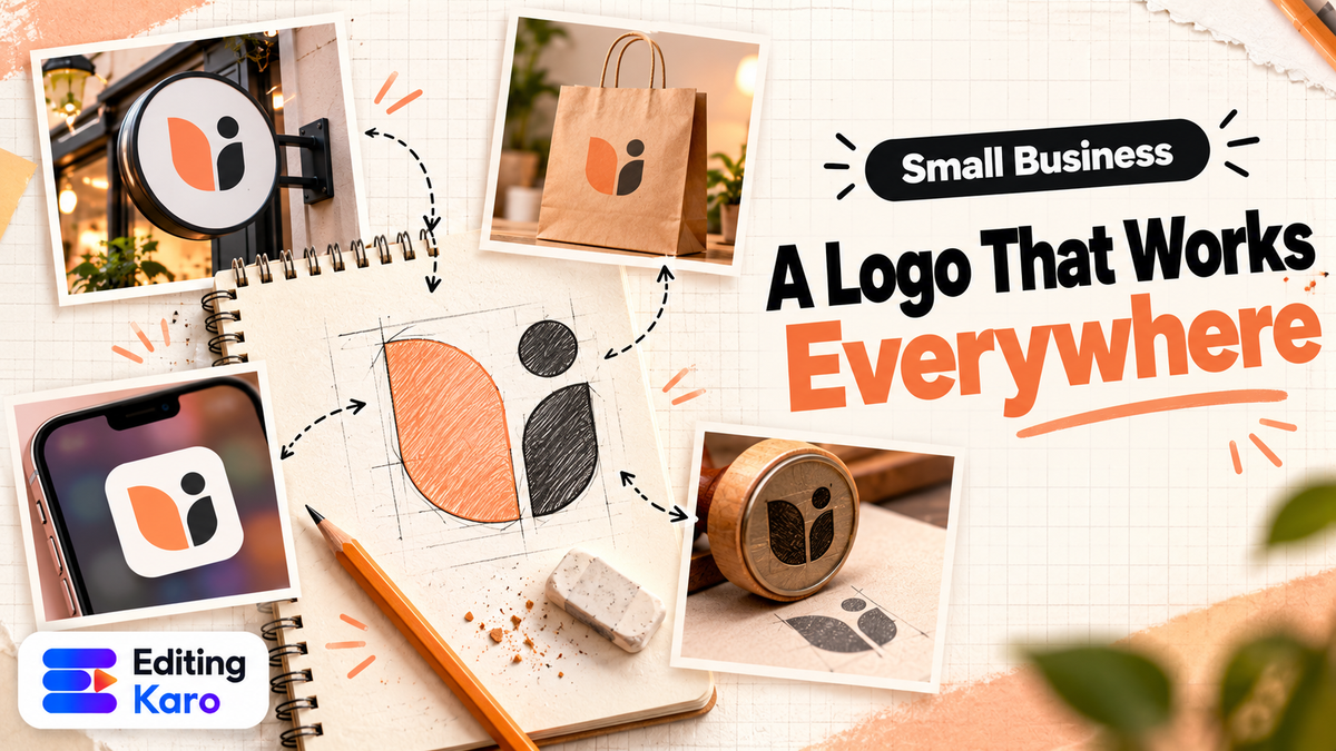
| Profile picture | Put it in a circle | Does the circle crop anything important? |
| One colour | Make it all black, then all white on black | Does it still work without colour? |
| Dark and light backgrounds | Place on both | Is it visible on both? |
| Real mockups | On a shop sign, a bag, a phone screen | Does it feel right in real use? |
| The squint test | Squint at it from across the room | Is the shape clear? |
If it fails the tiny-size test, simplify: remove the tagline, thicken thin lines, drop small details. Many brands have a full logo and a simplified mark for small spaces, and that's perfectly fine.
Step 7: Export the files you'll need
| File | Use |
|---|---|
| Transparent PNG (full logo) | Website, designs, videos, presentations |
| Transparent PNG (white version) | For dark backgrounds |
| Square version | Instagram, WhatsApp, YouTube profile pictures |
| High-resolution PNG or PDF | Printing visiting cards, bags, stickers |
| Favicon | Your website's browser tab icon |
Pixel Studio exports PNG (with a transparent background on paid plans), JPG and PDF. For the website icon, the free favicon generator turns your square logo into every favicon size browsers need.
For large signboards, ask your printer what they need. Many will want a vector file or a very high-resolution PDF. Send them the cleanest version you have, and ask for a printed proof before the full run.
Using AI for logos: helpful, with limits
AI image tools can generate dozens of logo-style concepts in seconds, which is useful for exploring directions. But using the raw output as your final logo has real problems:
- Messy details. AI images often have uneven lines, extra shapes and misspelled letters.
- Not vector. The output is a picture, not a clean shape that scales to a billboard.
- Similarity risk. It may resemble an existing brand's mark without you knowing.
- Ownership questions. Copyright protection for purely AI-generated images is unsettled in many countries, which can complicate protecting it later.
A better workflow: use Vision Studio to explore ideas and moods, pick a direction, then rebuild it simply yourself with real text and clean shapes. The final logo is then genuinely your design.
Why make it in Editing Karo
A logo isn't finished when it's designed. It's finished when it's on everything. That's where keeping it in the same place you make your content pays off:
- Save it once in the brand kit, along with your colours and text styles. It's then one click away in every Pixel Studio design and every Motion Studio video.
- Export every version you need from one design: transparent PNG (paid plans), JPG, and PDF for the printer.
- Make the favicon with the free favicon generator.
- Put it to work straight away: an Instagram profile picture, a WhatsApp Business photo, a corner mark on your Reels, a sticker for packaging, all from the same file.
- Keep templates on-brand: when you start from a Pixel Studio template, one click recolours any element to your saved brand colours.
The result is that your posts, Stories, videos and offer cards look like one business from day one, which is what makes a simple logo recognisable.
Before you print: trademark basics in India
A logo you've spent money printing on signboards, packaging and uniforms is a business asset. Two steps protect it:
- 1Search first. The Trade Marks Registry's public search lets you check whether a similar name or logo is already registered in your category (IP India). Finding out after printing is expensive.
- 2Consider registering. Trademark registration isn't required to use a logo, but it gives you stronger rights if someone copies it. Applications are filed on Form TM-A. The e-filing fee for individuals, startups and small enterprises is ₹4,500 per class, and ₹9,000 for others (official fee schedule). Small enterprises usually need their Udyam registration to claim the lower fee.
Trademark law has details that matter (classes, objections, opposition), so for anything beyond a simple filing, a trademark attorney is worth the fee. You can use the ™ symbol once you've applied; ® only after registration.
Common logo mistakes
- Too much detail that disappears at small sizes
- Too many colours, expensive to print and hard to recognise
- Trendy effects (gradients, 3D, glows) that date quickly
- Unreadable script fonts for the business name
- Copying a big brand's style too closely
- Only one file, usually a JPG with a white box around it
Start simple, refine later
Your first logo doesn't have to be your forever logo. Plenty of famous brands began with something basic and refined it once they understood their customers. What matters now is a logo that's clean, consistent and used everywhere: your shop, your bags, your Instagram, your WhatsApp.
Consistency is what turns a simple mark into something people recognise from across the street.
Open a square canvas in Pixel Studio, type your business name in three fonts, and run the tiny-size test. Within an hour you'll know which direction is right.
Frequently asked questions
Can I make a logo for free?
Yes. A clean wordmark or simple symbol made in a design tool can serve a small business well for years. What costs money is usually professional strategy, custom lettering and trademark registration, which you can add later as the business grows.
Can I use an AI-generated logo?
You can use AI for ideas and rough concepts, but be careful using the raw output as your final logo. AI images often have messy shapes and misspelled text, may resemble existing marks, and copyright protection for purely AI-generated work is uncertain. Redraw the idea cleanly as your own design.
What file formats do I need for a logo?
At minimum: a transparent PNG for digital use, a high-resolution PNG or PDF for printing, and a square version for profile pictures. A vector file (SVG or PDF) is ideal for large signboards and printing because it scales without losing quality.
How many colours should a logo have?
One to three. Fewer colours make the logo cheaper to print, easier to recognise and easier to adapt. Your logo should also work in a single colour, for stamps, embroidery and black-and-white printing.
Do I need to register my logo as a trademark?
It isn't required to use a logo, but registration gives you stronger legal protection if someone copies it. In India you can file online with the Trade Marks Registry; for individuals, startups and small enterprises the e-filing fee is ₹4,500 per class. Search existing marks before you apply.