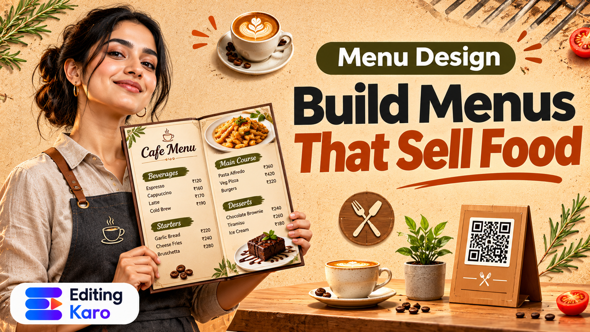
A restaurant menu is far more than a simple list of dishes and prices. It is your most powerful in-house sales tool.
Every customer who sits at your tables spends several minutes studying that single document.
Yet, countless cafes and restaurants across India print cluttered, confusing menus. They use tiny unreadable fonts. They bury their most profitable chef specials in dense paragraphs. They also line up prices with dotted leader lines that encourage customers to shop for the cheapest number on the page.
Mastering restaurant menu card design transforms your menu from an administrative inventory list into a high-converting merchandising showcase.
Here is how to design a restaurant menu that delights diners, speeds up table turnaround, and measurably increases your average order value.
The psychology of menu engineering
Before you open an editor or select a font, you must understand menu engineering. This hospitality framework categorizes every item in your kitchen into one of four quadrants based on its profitability and popularity.
As demonstrated in classic hospitality research published by the Cornell University School of Hotel Administration, positioning high-margin items in eye-tracking sweet spots directly influences ordering patterns.
| Item Category | Popularity | Profit Margin | Strategic Design Action |
|---|---|---|---|
| Stars | High popularity | High margin | Highlight prominently in shaded boxes or borders with appetizing descriptions |
| Puzzles | Low popularity | High margin | Rewrite descriptions with sensory adjectives or feature a hero photo to drive trials |
| Plowhorses | High popularity | Low margin | Keep on menu but do not feature; subtly increase price or adjust portion costs |
| Dogs | Low popularity | Low margin | Simplify or remove entirely to eliminate kitchen clutter and ingredient waste |
Take a concrete example: imagine a modern sourdough cafe and cloud kitchen in Pune expanding its dine-in and online delivery menu.
Their artisan avocado toast is a Star: high margin, widely loved. Instead of listing it halfway down a generic breakfast column, they place it inside a subtle warm olive border at the top-right of the page.
Their signature cold brew tonic is a Puzzle: high margin, but guests are unsure what it tastes like. They add a two-line sensory description: "Single-origin Chikmagalur espresso poured over sparkling citrus tonic with rosemary". Orders immediately jump.
The Golden Triangle: mapping the diner's eye
When a customer opens a two-panel bi-fold menu, their eyes do not read like a book from top-left to bottom-right. Instead, eye-tracking studies show they follow the Golden Triangle:
- 1First Stop (The Center / Top Right): Diners look first at the middle or upper-right of the right panel. This is your prime real estate. Reserve this spot for your highest-margin Star dishes.
- 2Second Stop (The Top Left): Eyes move next to the top left of the left page, where diners naturally look for appetizers, starters, and small plates.
- 3Third Stop (The Bottom Right): Finally, their gaze travels down to the bottom right, which is the traditional territory for desserts, signature beverages, and family platters.
Use callout boxes, subtle background tints, or elegant decorative badges to draw attention to your core profitable items within these visual anchor zones.
Step 1: Typography and low-light readability
Restaurant lighting is frequently romantic, warm, and dim. If your body text is set in a thin grey typeface, guests will struggle to read your offerings, causing awkward delays.
Follow these strict typographic rules.
- Pair display headers with neutral body text: Use a distinctive serif or modern display typeface for section titles like "Wood-Fired Pizza" or "Small Plates". Pair it with an ultra-clean sans-serif for descriptions. Review our font pairing guide to balance visual character with clarity.
- Maintain minimum point sizes: Set dish titles to at least 12 to 14 points, dish descriptions to 10 to 11 points, and prices to 11 to 12 points.
- Ensure high contrast: Dark charcoal text (#1A1A1A) on a warm cream or off-white background (#FAF7F2) provides optimal legibility under 2700K warm incandescent restaurant lighting. Review our guide on text contrast and readability and use our free color contrast checker to verify legibility.
Step 2: The price formatting secret: drop the currency symbols
One of the biggest mistakes on Indian menu cards is aligning prices on the far-right edge with dotted leader lines:
Butter Chicken .............................................. ₹380
Paneer Tikka ............................................... ₹290
Dotted leader lines train customers to scan down the right edge of the page like an accountant, picking whatever dish fits their budget rather than what their appetite desires.
Instead, nestle the price cleanly at the end of the dish description in the exact same font weight, omitting the rupee symbol.
Butter Chicken
Tender tandoori chicken simmered in a slow-cooked tomato, butter, and cashew gravy. 380
By embedding the number naturally within the prose, you soften the psychological pain of paying, encouraging diners to choose dishes based on taste and appetite.
Step 3: Food photography: three hero shots beat twenty thumbnails
Many casual dhabas and diners try to include a tiny photo next to every single dish. The result looks cluttered, cheap, and chaotic.
Instead, adopt the fine-dining editorial approach:
- 1Feature three to five exceptional hero photos: Select only your absolute signature dishes.
- 2Shoot in natural daylight: Photograph dishes from a 45-degree diner angle near large windows, capturing authentic steam, crispy edges, and glossy sauces.
- 3Color-grade for warmth: Ensure food tones are warm and inviting. Cold blue tints make cooked food look unappealing.
In our guide to Google Business Profile photos, we explain how professional food imagery drives physical foot traffic to dining establishments.
Furthermore, ensure your menu complies with FSSAI regulations for food service establishments, displaying standard green vegetarian dots and red non-vegetarian triangles clearly next to dish names.
Step 4: Structuring dessert and beverage inserts
Beverages and desserts represent high gross margin items in any restaurant kitchen. A mocktail or cold brew often carries an 80 percent gross margin. Yet restaurants frequently bury these drinks on the back page where customers rarely look.
To unlock beverage revenue, create a dedicated slim insert card (such as a 4 × 9 inch vertical table tent):
- 1Keep it permanently on the table: The beverage card stays in front of diners while they wait for their food menu.
- 2Feature seasonal craft drinks: Highlight two seasonal refreshers, such as a mango cooler in summer or spiced Kashmiri kahwa in winter.
- 3Promote shared dessert platters: Frame desserts as celebratory sharing platters for the entire table.
Separating drinks onto a dedicated card prevents the main dining menu from feeling overwhelming.
Step 5: Building digital QR table menus
Printed menus get stained and dog-eared over time. Having a synchronized digital QR menu placed on table tents or wall plaques gives guests an instant contactless backup.
- 1Design your clean mobile-friendly menu layout.
- 2Generate a high-contrast QR code using our free QR code generator.
- 3Link the QR code to a fast-loading mobile page or PDF hosted online.
- 4Test the scan using multiple smartphone models in low dining room lighting before printing table stands.
Doing it in Editing Karo
Editing Karo provides intuitive layout and photo tools that allow restaurant owners to design publication-grade menus without costly design agencies.
Here is how Pixel Studio supports your dining establishment:
| Task | Feature / Tool | Practical Benefit |
|---|---|---|
| Multi-column grid layout | Pixel Studio Canvas | Align category headers, ingredients, and prices across clean columns |
| Food photo enhancement | AI Photo Tools | Enhance color pop, balance warm tones, and sharpen dish textures |
| Font styling and pairings | Font Library & Pairings | Pair expressive display fonts with legible body typefaces |
| Contactless table QR codes | QR Code Generator | Create custom vector QR codes for dining tables and delivery packaging |
| High-res print export | Pixel Studio Export | Export print-ready 300 DPI PDFs for commercial cardstock lamination |
All four creative studios are open to every Editing Karo user. Free plans allow you to build and export standard menu layouts. Upgrading to Starter or Pro removes export watermarks and gives you unlimited saved menu templates for seasonal updates.
A pre-print menu checklist
Before sending your menu design to your local print shop, run through this five-point verification:
- [ ] Spelling and ingredient check: Did two different staff members proofread dish names and culinary terms?
- [ ] FSSAI symbols: Are veg and non-veg dietary indicators placed consistently on every item?
- [ ] Price consistency: Do menu prices match your POS billing system exactly, including tax disclosures?
- [ ] Low-light readability: Did you print a test sheet and inspect it under dim dining room lights?
- [ ] Print margins: Is all text kept at least 0.5 inches away from paper edges to accommodate laminate trim?
Transform your dining room experience today. Open Pixel Studio, set up your custom menu canvas, and create a dining showcase that drives bigger orders and happier guests.
Frequently asked questions
What makes a restaurant menu design effective?
An effective menu design organizes dishes logically, highlights high-margin signature items with visual callout boxes, uses legible typography that guests can read in dim lighting, and keeps pricing unobtrusive.
What is menu engineering in restaurant management?
Menu engineering is the practice of categorizing menu items by profitability and popularity, then strategically placing high-margin items in focal areas where diners look first to maximize revenue.
Should I include rupee symbols next to prices on my menu?
Hospitality research suggests omitting currency symbols or setting prices in the same font size immediately following the item description. Leading dotted leader lines to bold prices encourages price shopping.
What size should a printed restaurant menu card be?
Standard printed menu dimensions include A4 (8.27 × 11.69 inches) for single sheets or bi-folds, and slim panel formats (4.25 × 11 inches) for cocktail, dessert, and beverage inserts.
How many items should be listed on a restaurant menu?
Limit each food category to between seven and ten choices. Offering too many dishes creates choice paralysis for guests and increases kitchen prep waste.
What fonts work best for printed food menus?
Pair an elegant serif or characterful display font for category titles (like Playfair, Cormorant, or Unbounded) with a crisp, neutral sans-serif (like Inter or Roboto) for dish ingredients and prices.
Should every dish have a photo on the menu card?
No, illustrating every single dish makes the menu look crowded like a fast-food leaflet. Select three to five exceptional, professionally photographed signature dishes to anchor your key pages.
How do I make my menu readable in romantic, dim restaurant lighting?
Maintain high contrast between text and background. Use dark charcoal text on cream or off-white paper, and keep body font sizes at 10 points or larger with generous line spacing.
What information must be included on an Indian restaurant menu?
Display mandatory green veg and red non-veg dietary symbols, list common allergens where possible, describe primary ingredients, and mention applicable GST and service charges clearly at the bottom.
How do I create a contactless digital QR menu for dining tables?
Generate a high-contrast QR code linking directly to your online menu PDF or mobile landing page, print it on table tents or acrylic stands, and verify it scans quickly on mobile phone cameras.
How often should a restaurant update its menu design?
Review and refresh your menu layout at least once or twice a year to adjust for seasonal ingredient costs, update pricing, retire unpopular items, and introduce fresh chef specials.
What is the Golden Triangle in menu layout design?
The Golden Triangle refers to the natural eye movement of diners when opening a two-page menu: eyes look first at the middle of the right page, then the top right, then the top left.
How do I write appetizing food menu descriptions?
Use sensory and geographical descriptors that explain preparation methods and flavours, such as slow-roasted, hand-ground spices, cold-pressed, or crisp golden-fried, rather than generic superlatives like delicious.
Hotel ya restaurant menu card design kaise kare?
Select your menu paper size, establish your visual categories (starters, mains, desserts), format dishes with two-column alignment, add high-contrast prices, and print on durable laminated cardstock.
What paper stock should be used for printing restaurant menus?
Use heavyweight cardstock between 300 GSM and 350 GSM. Apply a matte lamination or soft-touch coating to protect against food stains, moisture spills, and frequent handling.
Can I use AI to enhance food photos for my menu card?
Yes, you can use AI color pop and image enhancer tools to adjust white balance, sharpen details, and correct warm yellowish ambient lighting so dishes look fresh and appetizing.
How do I format combo meals and family platters?
Enclose combo offerings in shaded border boxes or distinct visual panels, clearly itemizing what the platter includes and calculating the total savings compared to ordering dishes separately.
Can I design restaurant menus in Editing Karo?
Yes, Pixel Studio allows you to build custom multi-column layouts, import high-resolution food photos, customize brand typography, and export print-ready PDFs and mobile images.
How do I generate a QR code for my menu in Editing Karo?
Use the free QR Code Generator tool in Editing Karo to generate clean, high-resolution vector QR codes linking to your online menu or digital PDF without paying subscription fees.
Do I need a graphic designer to make a professional cafe menu?
No, following proven grid alignment rules and utilizing pre-formatted design tools allows restaurant owners and managers to create publication-grade menus independently.