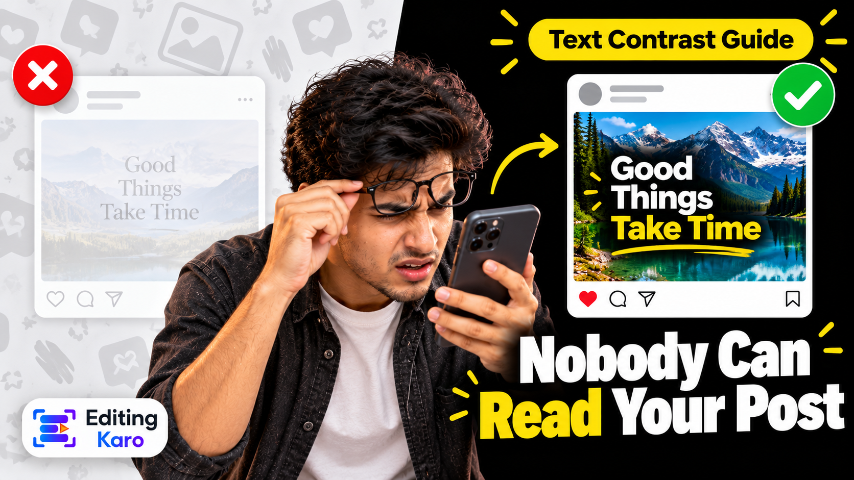
Why Nobody Can Read Your Post: Text Contrast and Legibility for Social Media Designs
Thin white text on a busy photo looks fine on your laptop and disappears on a phone in sunlight. The simple contrast rules, sizes and fixes that make every post readable.
Open all four studios free — no card, nothing to install.
Here's a small experiment. Open your last five posts on your phone. Turn the brightness down to about a third. Hold the phone at arm's length and give each post five seconds.
How many could you read completely?
When people try this, the result is usually humbling. A design that looked crisp on a bright 15-inch laptop turns into a nice picture with some faint shapes on it. And that dim phone is how most of your audience sees it — on a bus, outdoors, with battery saver on, while doing something else.
Unreadable text is the most common design problem on social media, and it's the easiest to fix. You don't need taste. You need three rules.
Rule 1: Contrast — the difference between text and background
Contrast is how different two colours are in brightness. Black on white is the maximum. Light grey on white is almost nothing.
It's measured as a ratio, from 1:1 (identical) to 21:1 (black on white). The widely used accessibility guidelines for the web, WCAG, set these minimums:
Text
Minimum ratio
Normal-size text
4.5:1
Large text (big headings)
3:1
Stricter level, normal text
7:1
Those numbers were written for websites, but they're a very good floor for posts too. For anything that will be read on a phone outdoors, we'd treat 4.5:1 as the minimum even for headings.
You don't have to calculate it. Paste your two colours into our free colour contrast checker and it gives the ratio and a pass or fail.
Combinations that fool people
Some pairs feel bold but measure badly, because both colours are of similar brightness:
Combination
Why it fails
White on yellow
Both very light
White on light pink, sky blue or mint
Pastels are light; white disappears
Red on green (or green on red)
Similar brightness, and invisible to many colour-blind viewers
Blue on black
Both dark
Orange on red
Close in both hue and brightness
Grey on a coloured background
Usually mid-tone on mid-tone
And pairs that reliably work:
Near-black on white, cream or yellow
White on navy, deep green, maroon, charcoal or black
Dark navy on pale blue; dark green on pale mint (dark and light of the same colour)
A simple way to think about it: one must be clearly dark and the other clearly light. Hue is decoration. Brightness does the work. If you're still choosing brand colours, our colour palette guide explains how to include a dark and a light in every palette for exactly this reason.
Rule 2: Text over photos needs help
A photo isn't one background colour. It's thousands — bright sky, dark hair, patterned fabric. White text will sit on a dark patch for one word and a bright patch for the next.
Five fixes, from lightest touch to strongest:
1Move the text to a calm area. Sky, a wall, a table top. Often the photo already has a quiet corner.
2Darken the whole photo. Add a black layer over the image at 30–50% opacity. The picture stays visible; white text now reads.
3Use a gradient. Transparent at the top fading to dark at the bottom, with text on the dark end. This keeps the subject bright.
4Put a solid panel behind the text. A coloured box or band. The most reliable option and it looks deliberate.
5Split the layout. Photo on one half, flat colour with text on the other.
Things that don't reliably work on their own: a thin drop shadow, a faint glow, or a hairline outline. They help a little at large sizes and not at all at small ones.
Tip: Blur the background photo slightly behind text-heavy designs. Detail is what makes a background "busy", and blur removes detail without changing the mood.
Rule 3: Size and weight
Contrast and size work together. Thin letters have fewer pixels to carry the colour, so a thin font needs more contrast and more size than a bold one.
For a 1080 px wide canvas:
Use
Size
Main headline
80–140 px
Sub-heading
48–64 px
Body text
36–44 px
Fine print
26–30 px, and only if it must be there
A few more habits:
Avoid thin and light weights for anything but very large headlines.
Don't write paragraphs in capitals. All-caps works for three or four words; beyond that it slows reading.
Give lines room. Line spacing of about 1.2–1.4 times the text size.
Keep lines short — roughly 5 to 8 words per line on a post.
Decorative and script fonts are for one or two words, not for information like prices, dates and addresses.
Left-align anything longer than two lines. Centred paragraphs are harder to follow.
Colour blindness is common — roughly one man in twelve has some form of it, most often trouble telling red from green. If your post says "green = available, red = sold out" using colour only, a noticeable share of your audience can't use it.
Add a second signal:
A label ("Sold out"), an icon (✓ / ✕), or a pattern
On charts and price tables, label values directly instead of relying on a colour key
For sale prices, strike through the old price as well as colouring the new one
Dark mode and thumbnails
Two places designs get caught out:
Transparent PNGs. A logo with dark text on a transparent background vanishes when the app is in dark mode. Give it a solid background or a light version.
Small previews. Your post appears as a tiny square or 3:4 tile on your profile and in shares. The headline should be readable — or at least recognisable — at that size. Zoom out to 15% in your editor to check.
The five-second phone test
Before you post anything:
1Send the design to your phone.
2Lower the brightness to about a third.
3Hold it at arm's length.
4Look for five seconds, then look away.
5Say out loud what it said.
If you can't repeat the main message, your audience won't get it either. Fix the biggest thing — usually contrast, then size — and test again.
Quick fixes for common situations
Text on a product photo: add a solid band at the top or bottom in your brand colour.
Festival post with a bright, busy illustration: put the greeting inside a plain shape — a circle or a rounded rectangle.
Quote post on a pastel background: switch the text from white to a dark shade of the same pastel.
Reel cover: large bold title on a darkened frame, inside the centre 3:4.
Story with a link sticker: keep text away from the sticker and give it its own background.
Do it once in your template
The efficient way to fix readability is to fix your templates. In Pixel Studio, set up your standard post with a text panel or overlay already in place, your heading and body sizes fixed, and two tested colour pairs — one dark-on-light, one light-on-dark. Check both pairs once in the contrast checker, and every post you duplicate from that template is readable by default.
Readable isn't boring. It's the difference between a post that looks good and a post that gets read.
Frequently asked questions
What is a good contrast ratio for text?
The Web Content Accessibility Guidelines recommend at least 4.5:1 for normal text and 3:1 for large text (roughly 24 px regular or 19 px bold and above). For social posts viewed on phones outdoors, higher is better.
How do I make text readable over a photo?
Put something between the text and the photo: a dark semi-transparent overlay across the image, a gradient behind the text area, or a solid panel. Then place the text over the calmest part of the picture.
Is white text on yellow readable?
No. White on yellow is one of the weakest combinations, usually under 2:1. Use black or very dark text on yellow.
What's the minimum text size for an Instagram post?
On a 1080 px wide canvas, keep body text at about 36 px or more and avoid anything below roughly 26 px. Headlines should be 60 px and up.
Do accessibility rules apply to social media images?
The formal guidelines were written for websites, but the principle carries over. Good contrast helps everyone, including people with low vision, older viewers and anyone on a dim screen in bright sun.
EK
About the author
Editing Karo Team
Designers, video editors and writers behind Editing Karo
We're the people who build Editing Karo's four studios — designers, video editors, writers and engineers based in Delhi. We spend our days making social posts, thumbnails, reels and captions, and watching what helps creators and small businesses get them out faster. Every guide here is written from that work: tested in our own tools, checked against each platform's current rules, and updated when those rules change.