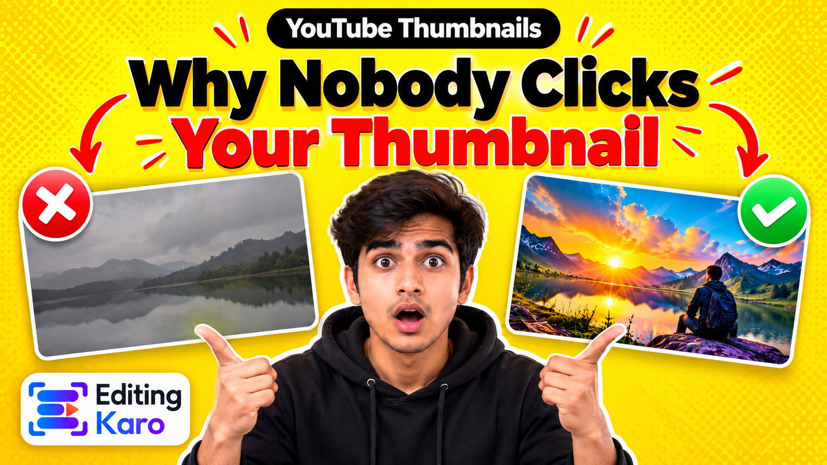
How to Design a YouTube Thumbnail That Gets Clicks (2026)
How to Design a YouTube Thumbnail People Actually Click
A thumbnail has about a second to earn a click. Here's how to design one that works at phone size — faces, text, contrast and the mistakes that quietly kill views.
Before anyone watches your video, they judge it by a picture roughly the size of a postage stamp. On the YouTube home screen on a phone, a thumbnail is often only a few centimetres wide, surrounded by a dozen others competing for the same tap. The title helps, but the thumbnail is what stops the scroll.
Open all four studios free — no card, nothing to install.
The good news is that thumbnails that work follow a small set of rules. None of them needs expensive software or a design degree.
Start with the right canvas
Spec
Value
Size
1280 × 720 pixels
Ratio
16:9
Minimum width
640 pixels
File size
Under 2 MB
Formats
JPG, PNG or non-animated GIF
Design at 1280 × 720 and export as JPG at high quality — it'll comfortably fit under 2 MB. If your file is too big, run it through the image compressor at around 85% quality. If you've made the design at another size, the image resizer has a YouTube thumbnail preset.
Tip: YouTube puts the video's length in the bottom-right corner of every thumbnail. Never put text, a face or the product there.
Rule 1: one subject, big
The most common thumbnail mistake is trying to show everything: the product, the host, the location, three arrows and a logo. At stamp size, all of that turns into noise.
Pick one thing the eye should land on and make it large — filling at least a third of the frame. That might be:
A face with a clear, honest expression (surprise, concentration, delight).
The result: the finished dish, the edited photo, the renovated room.
A before-and-after split, with a clear line down the middle.
Everything else is background. Blur it, darken it or remove it.
Rule 2: three to five words, maximum
Text on a thumbnail isn't there to explain the video — that's the title's job. It's there to add a hook the title doesn't have.
If the title is "How I Edited 30 Reels in One Afternoon", the thumbnail doesn't need to say "30 Reels in an afternoon". It could say "My whole system" or just "3 hours". The two work as a pair.
Keep the text:
Short — three to five words.
Heavy — a bold, condensed or rounded font, never a thin one.
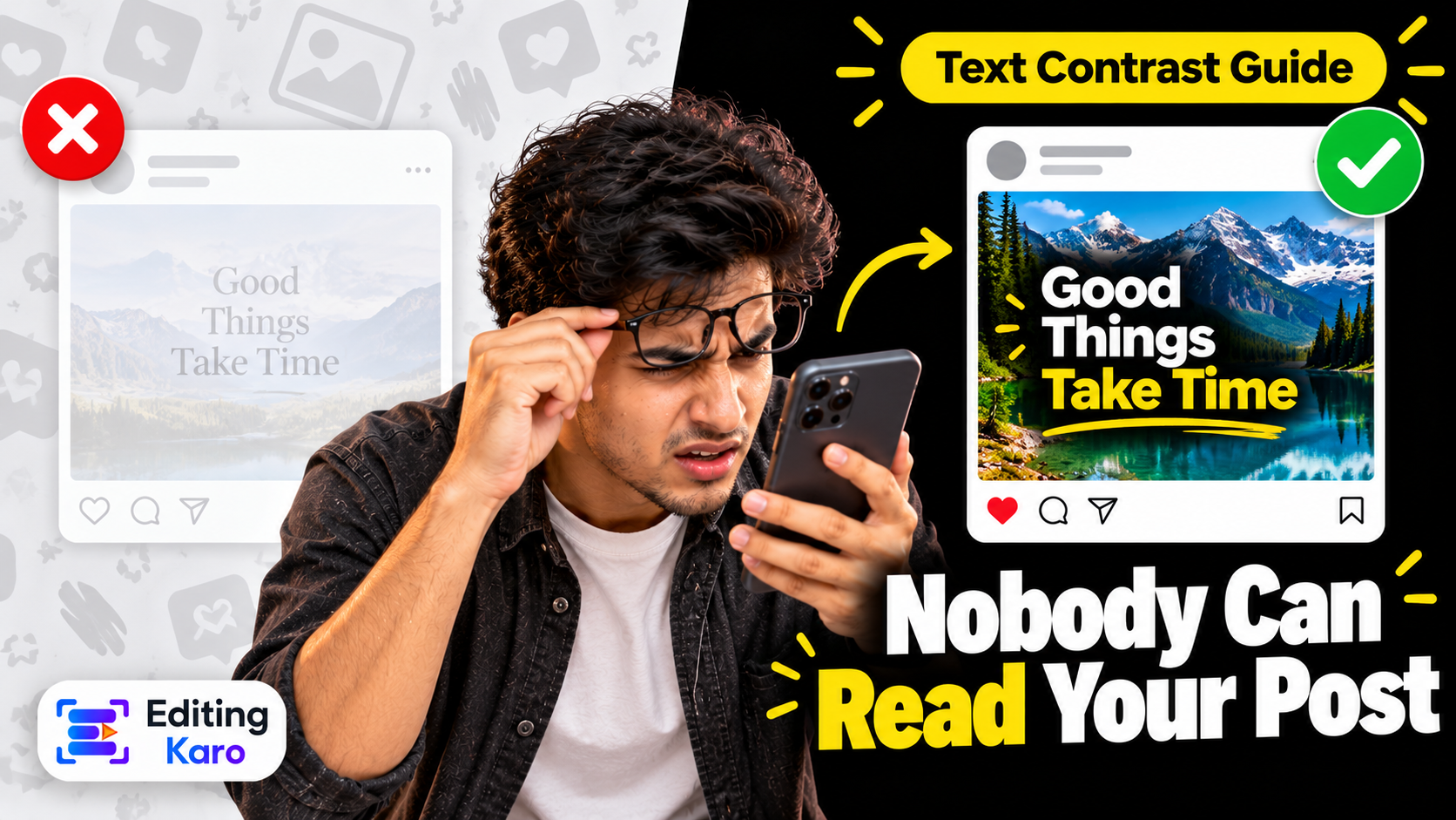
High contrast — white with a dark outline or shadow, or dark on a bright block of colour.
Condensed display fonts like Bebas Neue, Anton and Oswald are popular for exactly this reason: they fit big letters into a small width. You can compare pairings in the font pairing previewer.
Rule 3: contrast beats colour
A bright thumbnail isn't the same as a clear one. What makes a subject pop is contrast — light against dark, warm against cool, sharp against blurred.
Some quick ways to get it:
Brighten the subject and slightly darken the background.
Add a soft glow or outline around a cut-out subject.
Use one saturated accent colour and keep everything else muted.
Check that any text passes a contrast check against what's behind it — the colour contrast checker gives you the ratio instantly.
Also look at what the rest of your niche uses. If every cooking channel uses warm yellows, a cool blue background makes yours the odd one out — in a good way.
Rule 4: faces work, but only real ones
There's a reason so many thumbnails feature a person reacting: our eyes are drawn to faces, especially ones showing emotion. But viewers have seen thousands of fake shocked faces. What still works is an expression that honestly matches the video — curiosity for an experiment, satisfaction for a finished project, frustration for a "what went wrong" story.
Position the face on one side (usually left or right third) and let the eyes look towards the text or the object. People follow eyelines.
Rule 5: design for the phone, check at 20%
Most views come from phones, where your thumbnail is tiny. Before exporting:
1Zoom your design out to about 20%.
2Ask: can I tell what this is in one second? Can I read the text?
3Look at it next to screenshots of other thumbnails in your niche.
If anything becomes mush at 20%, simplify it. Fewer elements, bigger text, more contrast.
Stay consistent — but not identical
A recognisable style helps returning viewers spot your videos: the same font, a consistent colour, a similar layout. But if every thumbnail looks exactly the same, regular viewers can't tell your new video from the one they've already seen. Keep the style, change the subject and colour each time.
A simple way to do this is a thumbnail template: fixed font, fixed text position, fixed outline style, with the photo and accent colour swapped for each video. In Pixel Studio, save your layout once and duplicate it for every new video.
Test, don't guess
YouTube's Test & Compare lets you upload up to three thumbnails for one video and shows which one earns more watch time. Use it on your important videos, and learn from the results: does text help or hurt on your channel? Do faces win? Does a brighter background matter?
Thumbnails can also be changed at any time. If an older video with good content is getting few views, a new thumbnail is one of the cheapest experiments you can run.
Thumbnail checklist
1280 × 720, under 2 MB.
One clear subject, filling a third of the frame or more.
Three to five words of heavy, high-contrast text — not a copy of the title.
Bottom-right corner empty.
Readable at 20% zoom.
Consistent style, different content each time.
Need a quick start? Open Pixel Studio, choose the YouTube thumbnail format and build from a template — or generate a background in Vision Studio and place your photo and text on top.
Frequently asked questions
What size is a YouTube thumbnail?
1280 × 720 pixels (16:9), at least 640 pixels wide, under 2 MB, as JPG, PNG or non-animated GIF.
How much text should a thumbnail have?
Three to five words is a good ceiling. Anything more becomes unreadable at the size most people see it — a small tile on a phone.
Should my thumbnail repeat the video title?
No. The title and thumbnail are seen together, so the thumbnail text should add something — a result, a question or a reaction — instead of repeating the same words.
Do I need my face on every thumbnail?
No, but a face with a clear expression is one of the most reliable ways to catch attention. For tutorials and product videos, a clear before/after or the finished result often works just as well.
Can I change a thumbnail after publishing?
Yes, any time. Many creators revisit thumbnails on videos that are under-performing, and YouTube's Test & Compare feature lets you test up to three versions against each other.
EK
About the author
Editing Karo Team
Designers, video editors and writers behind Editing Karo
We're the people who build Editing Karo's four studios — designers, video editors, writers and engineers based in Delhi. We spend our days making social posts, thumbnails, reels and captions, and watching what helps creators and small businesses get them out faster. Every guide here is written from that work: tested in our own tools, checked against each platform's current rules, and updated when those rules change.