Instagram Carousel Design: A Slide-by-Slide Guide (2026)
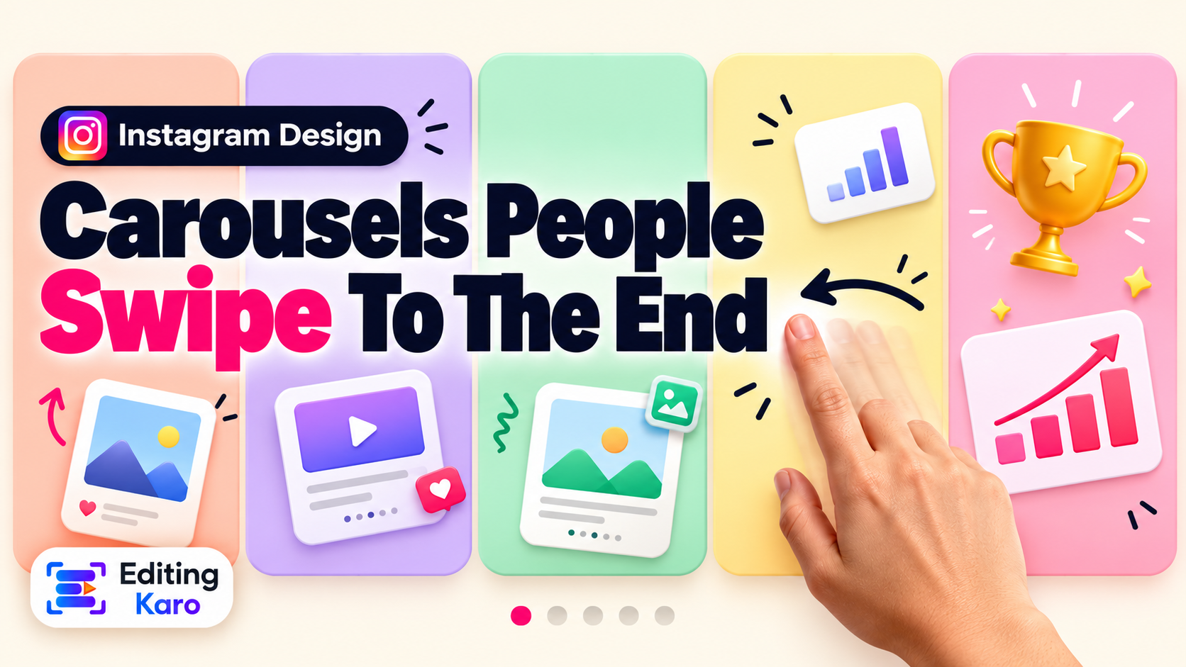
How to Design Instagram Carousels People Swipe to the End
Carousels earn more saves and shares than almost any other post type — if people swipe. A slide-by-slide guide to hooks, layout, text size and the last slide most people waste.
We design a lot of carousels — for our own pages and to test templates before they go into the editor. Over time one pattern has become hard to ignore: the carousels that do well are rarely the prettiest ones. They're the ones where slide one makes a clear promise and every slide after it keeps that promise quickly.
Open all four studios free — no card, nothing to install.
Carousels deserve the effort. Published social media benchmarks keep finding the same split: Reels reach more strangers, while carousels get more saves, shares and thoughtful comments per viewer. They're also the format that turns a visitor into a follower, because a good one proves you know something.
Here's how we build them, slide by slide.
Before you design: write it as a list
Open a notes app, not a design tool. Write:
1The promise in one line. ("5 mistakes that make a small shop's logo look cheap.")
2Each point as a single sentence.
3The action you want at the end.
If you can't write the points as single sentences, the idea isn't ready. Design can't fix an unclear thought; it can only decorate it.
Slide 1: the headline
Slide one has one job: stop the scroll and promise something specific. Treat it like a poster.
What works
A number and a result: "7 fonts that make menus easier to read"
A mistake: "Stop cropping your product photos like this"
A before/after split image
A question the reader is already asking: "Why do my Reels look blurry?"
What doesn't
Your logo and "Tips for you" in small type
A long sentence in three different fonts
A beautiful photo with no hint of what's inside
Keep it to roughly 6–10 words, as big as the canvas allows, with strong contrast. If the background is a photo, put a solid or tinted panel behind the text. You can test any text-and-background pair in our free colour contrast checker.
Slide 2: the second first impression
When someone scrolls past your carousel without swiping, Instagram often shows it to them again later — starting from the second slide. So slide two shouldn't be a throwaway "Let's dive in!" It should work as a hook in its own right: your strongest point, or a sharper restatement of the problem.
The middle slides: one idea each
This is where most carousels fall apart, usually from cramming.
One idea per slide. A heading, a line or two of explanation, perhaps an example.
Around 30 words or fewer.
A consistent layout. Heading in the same place, same size, every time. The reader's eye learns where to look and moves faster.
Number the slides ("3/8") or number the points. People like knowing how much is left.
Show, don't just tell. For design, food, fashion or product topics, an example image beats a sentence.
Text sizes that survive a phone
On a 1080 px wide canvas, as a starting point:
Element
Size
Slide 1 headline
90–140 px
Slide headings
60–80 px
Body text
36–44 px
Small labels, slide numbers
26–30 px
Anything under about 26 px is a gamble. After designing, look at the slide on your actual phone at arm's length. If you squint, go bigger. And stick to two fonts — a strong one for headings, a plain one for body. Our font pairing guide has combinations that work, and you can preview them in the font pairing previewer.
Tell people to swipe (without saying "swipe")
A carousel looks like a single image until someone moves it. Give a visual nudge:
A shape or photo that runs off the right edge and continues on the next slide.
A small arrow in the same corner of each slide.
An unfinished sentence: "The third one surprised us…"
A continuous background — one long gradient or illustration stretched across all slides, so each swipe reveals more of it.
That last trick is easy to set up. Design one wide canvas (for 5 slides at 1080 px, that's 5400 px wide), lay your content across it, then cut it into 1080 px pieces. Elements that cross the cut lines create the feeling of one continuous strip.
Size and safe areas
Design every slide at 1080 × 1350 px (4:5).
Your profile grid crops the first slide to 3:4, trimming a little from each side. Keep the headline away from the left and right edges — about 60 px of margin is enough.
Leave breathing room at the bottom, where the carousel dots sit.
Most carousels end on "Thanks for reading!" and waste their best moment. Someone who reached the last slide is the most interested person you'll meet all day. Ask for one action that fits the content:
A checklist or tutorial → "Save this for your next shoot."
A relatable or opinion post → "Send this to someone who does this."
A series → "Follow for part 2 on Friday."
A product or service → "DM us 'MENU' for the price list."
One ask. Three asks get you none.
It also helps to add a one-slide summary just before the ask, listing every point. Summary slides are what people screenshot and save.
Don't forget the caption
The carousel carries the content; the caption carries context and searchability. Restate the promise in the first line, add anything that didn't fit on the slides, and include the words someone might search for. Our guide to captions people actually read goes deeper, and the caption character counter keeps you inside the limits.
A reusable 8-slide structure
When we're short on time, this is the skeleton:
1Hook — the promise
2Why it matters — the problem, sharp enough to stand alone
3Point 1
4Point 2
5Point 3
6Point 4 (or an example / before-after)
7Summary — all points on one slide
8One ask
Build it once, reuse it forever
The first carousel takes the longest because you're also designing the system: margins, heading style, colours, the arrow, the last slide. After that, duplicate it and change the words.
In Pixel Studio, start from a 4:5 format, pick a template, set your brand colours and fonts, and duplicate the page for each slide so the layout stays locked. Export the pages as images and upload them in order. If you'd like a head start on the wording, Content Studio can draft the slide text from a topic — then edit it until it sounds like you.
The short version
Write the list before you design.
Slide 1 is a headline. Slide 2 is a second headline.
One idea, ~30 words, per slide.
Big type, two fonts, consistent layout.
Give a visual cue to swipe.
1080 × 1350, margins for the grid crop.
End with a summary and one ask.
Frequently asked questions
What size should Instagram carousel slides be?
1080 × 1350 pixels (4:5 portrait) takes the most space in the feed. All slides in one carousel share the same shape, so pick it for the first slide and keep to it.
How many slides should a carousel have?
As many as the idea needs and no more. For most tips, lists and tutorials, 6 to 10 slides is right. Instagram allows up to 20, but long carousels only work when each slide earns its place.
Do carousels get more reach than Reels?
Reels usually reach more new people. Carousels tend to earn more saves, shares and comments per viewer, and stay useful for longer. Most accounts do best with a mix.
How much text should I put on each slide?
One idea, roughly 30 words or fewer. If a slide needs a paragraph, split it into two slides. People read carousels on a phone at arm's length.
Can I mix photos and videos in a carousel?
Yes, Instagram lets you mix both in one carousel. Keep the same aspect ratio throughout so nothing gets cropped unexpectedly.
EK
About the author
Editing Karo Team
Designers, video editors and writers behind Editing Karo
We're the people who build Editing Karo's four studios — designers, video editors, writers and engineers based in Delhi. We spend our days making social posts, thumbnails, reels and captions, and watching what helps creators and small businesses get them out faster. Every guide here is written from that work: tested in our own tools, checked against each platform's current rules, and updated when those rules change.