Instagram Post Sizes in 2026: The Complete Guide for Posts, Stories and Reels
Every Instagram size you actually need — feed posts, carousels, Stories, Reels and profile photos — plus the grid crop that catches everyone out.
Editing Karo Team
Updated
Every Instagram size you actually need — feed posts, carousels, Stories, Reels and profile photos — plus the grid crop that catches everyone out.
Updated
Open all four studios free — no card, nothing to install.
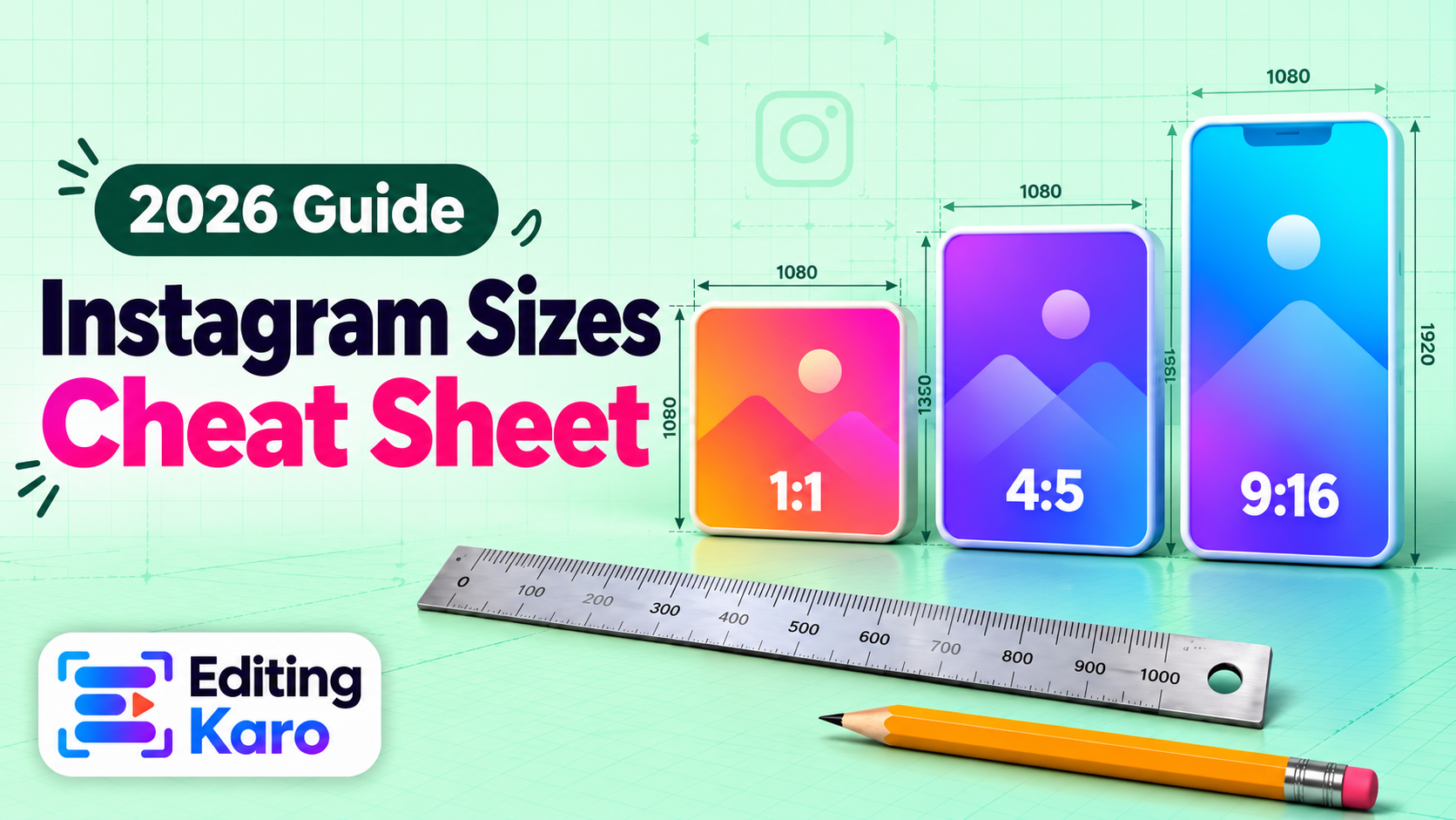
Instagram has changed its shapes more in the last two years than in the five before that. Portrait posts became the default, Reels took over the feed, and in early 2025 the profile grid quietly switched from squares to tall rectangles. If your posts look slightly off — a headline clipped in the grid, a product cut in half on the first carousel slide — it's almost always a size problem, not a design one.
This guide covers every size that matters, why each one exists, and the mistakes we see most often when creators and small brands send us their posts.
| Format | Size (pixels) | Ratio | Notes |
|---|---|---|---|
| Feed post (portrait) | 1080 × 1350 | 4:5 | The best default for almost everything |
| Feed post (square) | 1080 × 1080 | 1:1 | Fine, but smaller on screen |
| Feed post (landscape) | 1080 × 566 | 1.91:1 | Shows very small on phones — avoid |
| Carousel slide | 1080 × 1350 | 4:5 | All slides follow the first slide's ratio |
| Story | 1080 × 1920 | 9:16 | Keep text out of the top and bottom ~250 px |
| Reel | 1080 × 1920 | 9:16 | Grid shows the central 3:4 area |
| Profile photo | 320 × 320 | 1:1 | Shown as a circle |
If you only remember one number, make it 1080 × 1350. You can check any of these instantly in our social media size guide, or drop an image into the free image resizer and pick the preset.
People scroll Instagram with their thumb on a tall phone screen. A square post fills about half of that screen; a 4:5 post fills noticeably more. More screen means more time in front of someone's eyes before they scroll past — and that's the whole game.
There's no ranking bonus for using 4:5. The advantage is purely physical: a bigger post is harder to ignore. That's why most brands with a designer switched to portrait long ago, and why square posts now quietly read as "older" content.
Tip: If you're repurposing a square design, don't just stretch it. Add a band of background colour above and below, or rebuild the layout at 1080 × 1350 so the extra space is actually used.
In early 2025 Instagram changed the profile grid from squares to 3:4 rectangles. Your posts still appear in full in the feed — but the thumbnail on your profile is cropped:
This matters because your profile grid is your shop window. When someone taps your name, the grid is what decides whether they follow. If your headline runs edge to edge, the grid version will clip the first and last letters.
The fix is simple: keep a safe margin of about 60 pixels on the left and right of every feed design, and centre the important stuff. For Reels, design the cover so the middle 1080 × 1440 area works as a thumbnail on its own.
Stories are 1080 × 1920, but Instagram draws its own interface on top: your profile picture and name at the top, the reply bar and buttons at the bottom. Anything important in roughly the top 250 pixels or bottom 250 pixels risks being covered.
A practical layout for Stories:
Reels are recorded and exported at 1080 × 1920. Two areas get covered while a Reel plays: the caption, username and audio line at the bottom, and the like/comment/share buttons down the right side. Keep burned-in captions and key text in the centre of the frame, a little above the middle.
For the cover, remember the grid crop from earlier. A cover that works in the grid has one clear subject and a short title, both inside the central 3:4 area. If you edit Reels in the browser, Motion Studio exports at exactly 1080 × 1920; you can design the cover in Pixel Studio at the same size.
A carousel can mix photos and videos, but it can't mix shapes. Whatever ratio the first slide has, Instagram crops every other slide to match. That's where half-cropped products and cut-off text on slide 4 come from.
Export every slide at 1080 × 1350 and you'll never hit this. If you're making a "swipe" design where one image spans several slides, build it as one wide canvas (for three slides, 3240 × 1350) and slice it into three 1080-wide pieces.
Instagram re-compresses everything. Two things make that compression kinder:
Text-heavy designs survive compression better as PNG than JPG, because PNG keeps sharp edges around letters.
Platforms change these numbers every year or two. Rather than memorising them, keep a reference open. Our social media size guide is updated whenever a platform changes its specs, and every size there opens straight into the image resizer with one click. And if you're starting a design from scratch, pick the Instagram format in Pixel Studio and the canvas is already the right size.
1080 × 1350 pixels (4:5). It's the tallest ratio the feed shows, so it gets the most attention while people scroll. Square 1080 × 1080 is fine but gives up about 20% of the screen.
Since early 2025 the profile grid shows every post as a 3:4 rectangle. A 4:5 post loses a thin strip on the left and right in the grid (not in the feed), and a square post loses more. Keep faces and text towards the centre.
Make the cover 1080 × 1920 like the Reel itself, but design it so the central 3:4 area (about 1080 × 1440) works on its own — that's the part your profile grid shows.
You can, but Instagram scales them down to 1080 pixels wide and re-compresses them. Uploading at 1080 wide yourself means you control how the image is sharpened and compressed.
Yes. The first slide sets the ratio and Instagram crops the rest to match, so export every slide at the same size — 1080 × 1350 is the safest choice.