How to add text to a photo so it's easy to read
Text on a photo has one job: be read in the second someone scrolls past. These rules keep it readable and looking designed.
Put text on the quiet part of the photo
Look for sky, wall, water or blurred background, and place the text there — not across a face or a busy pattern. No quiet space? Use the AI image extender to add some, or change the background.
Use two fonts, not five
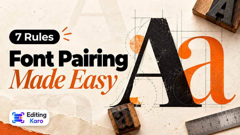
A heading font and a body font is enough. The font combinations in the Text panel pair them for you — a strong heading with a clean body text. Our font pairing guide explains why some pairs work and others clash.
Make the contrast obvious
Light text on dark areas, dark text on light areas. When the photo is mixed, add a soft shadow, a subtle gradient behind the text, or a solid shape. Our colour contrast checker shows whether two colours are readable together.
Keep it short and big
On a phone, a headline of three to six words at a large size beats a paragraph. Put the details in the caption, not on the picture.
Mind the platform's covered areas
Stories and Reels hide the top and bottom of the frame behind buttons and captions. Keep important text in the middle. For feed posts, see our Instagram post size guide.
Ideas that work well
- Quote posts: a calm photo, one line of text in a serif heading font, your handle small at the bottom.
- Offer posts: product photo, the price in a bold display font, a short call to action in a solid shape.
- Festival greetings: a festive photo with the greeting in large type and your shop name below.
- Travel posts: the place name over the sky, the dates in small capitals above it.
Save the look you like as a template-style design and reuse it, so every post in a series matches.
Export at the right size
Export a PNG for sharp text, or JPG for smaller files. The Free plan exports up to 720p with a small watermark; paid plans export without a watermark at up to 4K. See pricing.