
How to design a banner that works at a glance
Banners are seen fast and often from far away — at the top of a web page, on a screen in a shop, or on a flex outside. Clarity beats detail.
Pick the size for the place
A 1920 × 1080 banner suits screens, slides and many website heroes. Web banners for ads and headers come in other shapes; type the exact size in Settings before you start. For printed flex, ask the printer for the final size in feet and keep the same ratio — a 6 × 3 ft flex is a 2:1 canvas.
One headline, one action
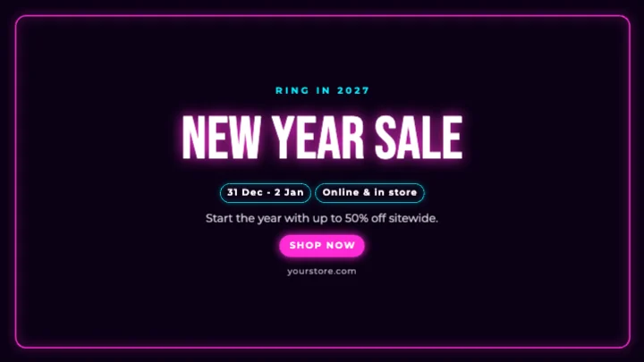
Use one short headline and one action: "Shop the sale", "Register free", "Call now". On a website, the button itself is usually built by the site, so leave space for it rather than drawing one into the image.
Split the frame
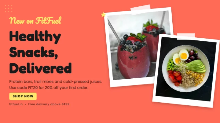
A simple layout works for most banners: text on one side, the image on the other. Keep the main text away from the edges, because many websites crop banners differently on phones.
Contrast and size
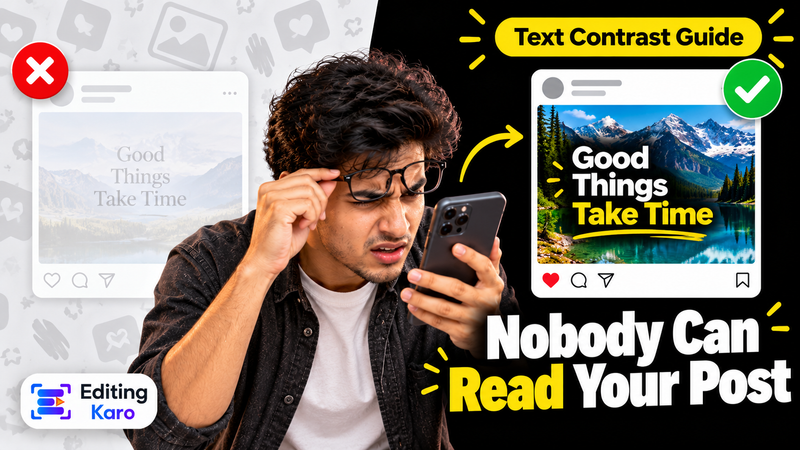
Text must read from a distance or at a glance. Use a heavy font, a plain background behind the words, and strong contrast. Our guide to readable text on social posts applies to banners too.
Clean product images
Products on a cluttered table look cheap. Use background removal and place them on a solid colour or soft gradient. For extra room around a photo, the AI image extender widens it to fit.
Export right
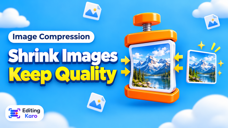
JPG for photo-heavy web banners (small file, fast page). PNG for banners with flat colours and sharp text. PDF for print. Large banners load slowly; the free image compressor shrinks a JPG without visible loss.
Make the set
The same campaign usually needs a website banner, a square post and a story. Duplicate your banner, change the canvas size, and adjust — the colours and fonts stay the same.
What's free
Banner templates, custom sizes and 4 AI photo tool uses a month are on the Free plan. Free exports go up to 720p with a small watermark; paid plans from ₹499 a month export without it up to 4K. See pricing.