How to design a menu that sells more
A menu is the last thing a customer reads before ordering. Good design makes it quick to choose — and nudges them toward the dishes you most want to sell.
Group dishes the way people order
Starters, mains, breads and rice, desserts, drinks. For a cafe: coffee, tea, shakes, snacks. Clear sections with large headings let people find what they want in seconds.
Keep descriptions short
One short line under a dish name is enough: what's in it and how it's made. "Slow-cooked black dal with butter and cream" sells better than just "Dal Makhani", but a paragraph will not be read.
Put your best sellers where eyes land
People look at the top right and the first item of each section first. Put your signature dish or best-margin item there, perhaps with a small photo or a "Chef's special" tag.
Mark veg and non-veg clearly
Use the green and red dot symbols your customers expect, next to each dish. It saves questions and builds trust.
Make prices easy to read and easy to change
Line prices up in one column. Because every item is editable text, updating a price takes a minute — no need to redesign. Download a fresh PDF and print.
Use one great photo
One appetising photo of your star dish works better than many small ones. Use the AI photo enhancer to brighten a dull shot, or remove the background and place it on a plain colour.
Make a WhatsApp version
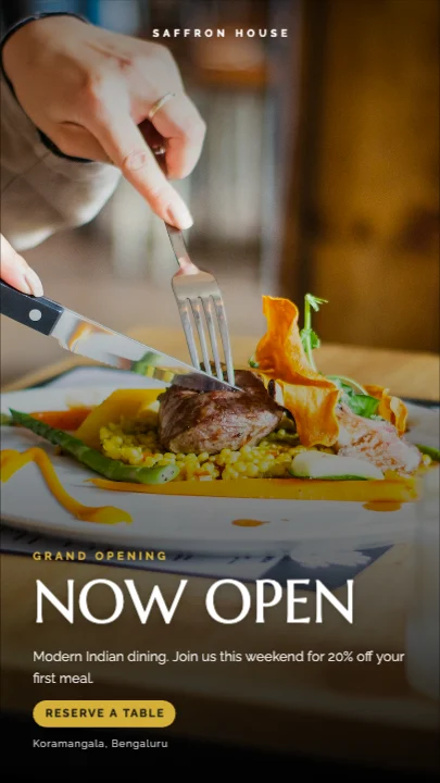
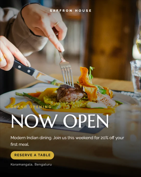
Most cloud kitchen orders start on WhatsApp. Make a tall 4:5 or 9:16 version of the menu with your phone number in large text. Tips are in our guide to WhatsApp marketing for small shops.
Print it well
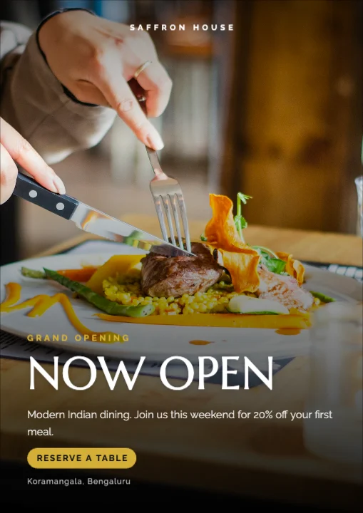
For tables, print on thick paper and laminate, or use a stand-up card. Export a PDF at A4; a print shop can make A5 or tall DL sizes from the same file.
What's free
Menu templates and 4 AI photo tool uses a month are on the Free plan. Free exports go up to 720p with a small watermark; for print-sharp menus without a watermark, paid plans from ₹499 a month export up to 4K. See pricing.